


A living room feels calm not because it is empty, but because every colour in it agrees with every other. The walls and the rug, the sofa and the cushions, the throw on the arm of the chair — when these speak in the same tonal language, the room reads as one composition. When one piece argues with the rest, the eye notices, and the room loses its ease.
This is not about beige minimalism or restrained palettes. It is about palette discipline. A calm room can hold deep bordeaux. It can hold near-black charcoal. It can hold warmth, depth, and contrast. What it cannot hold is randomness — a colour added because it was on sale, a cushion that came from a different mood than the rest of the room.
This guide is about how to build a palette that holds the room together. Not a single list of "the right colours", but a way of thinking about how tones work with each other, which combinations land calm, and where each colour belongs.

The principle: three layers, three roles
Most calm rooms work because they layer colour in three roles.
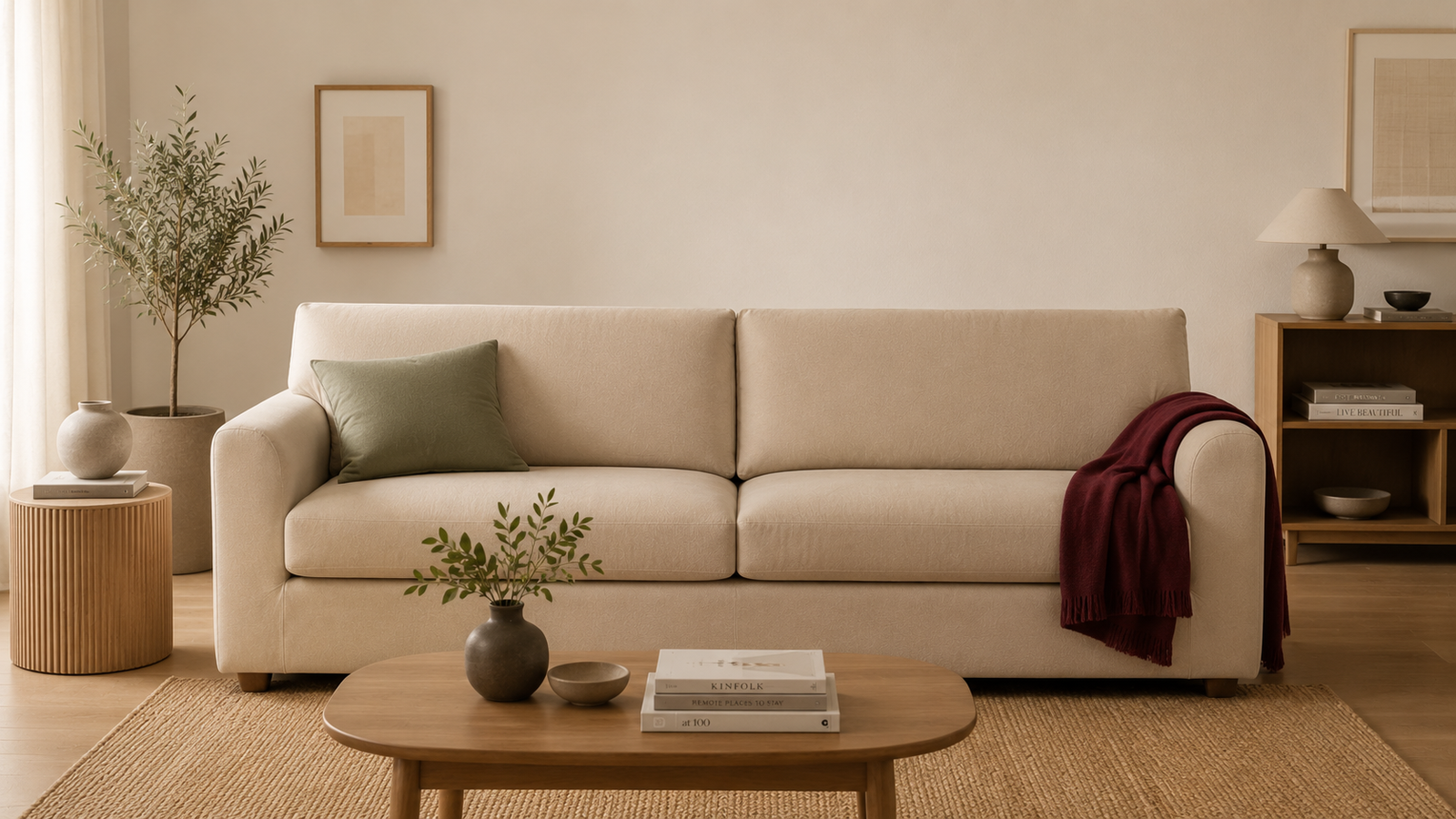
The base. The largest visible surface — usually the sofa, walls, or floor. The base sets the temperature of the room: warm or cool, light or dark. Most calm rooms have a warm light base — beige, greige, ivory, soft sand.
The accent. The next-largest surfaces — cushions, curtains, throws, a chair. Accents either deepen the base (a sand beige sofa with greige cushions) or contrast it gently (a beige sofa with sage cushions). Accents do not fight the base; they extend it.
The punctuation. Small, deliberate flashes of stronger colour — a single bordeaux throw, a charcoal vase, a deep green plant. Punctuation gives the room a focal note without taking it over.
The mistake most rooms make is reversing the layers — too much punctuation, not enough base. A sofa in bright cobalt with mustard cushions and a pink throw is three pieces of punctuation trying to be the base. The eye has nowhere calm to rest.
Calm rooms put the calm colour where there is the most of it.

The six tones that ground a calm room
These six work as bases or accents in almost any calm room. They pair with each other, with raw wood, with stone and ceramic, and with the lived-in materials that complete a home.
Ivory. Almost white but with a warm undertone. The lightest of the calm tones. Reads as clean without being clinical. Works as a sofa cover in rooms with strong natural light. Pairs well with oak, cream linen, and natural stone.
Sand beige. A warm light beige with a hint of yellow undertone. The classic warm neutral. Suits south-facing living rooms with golden afternoon light. Pairs with light wood, cane, ceramic, and dried grasses.
Greige. Grey-beige — the colour that has been the calm sofa colour of choice for the last decade. Slightly cooler than beige, slightly warmer than grey. Lives well in north-facing rooms and rooms with blue-grey daylight. Pairs with concrete, smoked oak, linen curtains.
Sage mist. A soft green-grey, dustier than emerald, calmer than mint. A surprising base colour that grounds a room without going neutral. Pairs with cream, oak, and ceramic. Suits rooms with plants.
Charcoal. A deep grey-black. The architectural choice. Works as a base only in larger rooms with strong natural light; in smaller rooms, it works better as an accent. Pairs with cream, raw wood, and brass.
Bordeaux. A deep wine red — the calm version of red. Used carefully (a throw, a single cushion, a chair), it punctuates a neutral room with warmth. Used as a base, only in confident rooms with strong supporting materials. Pairs with cream, dark wood, and brass.
Browse colours in our stretch sofa covers range to see how these tones translate to real sofa surfaces.

Three palette directions for a calm room
There are three ways to combine these six tones into a coherent room.
Direction one: warm neutrals
The most forgiving palette and the most common. Build the room around sand beige or greige as the base, with ivory or a deeper warm beige as the accent. Punctuate with bordeaux or charcoal in small, considered places.
The feeling: a room that reads gentle, warm, and lived-in. A sofa to come home to. A space that takes light beautifully through the day.
The risk: if every tone is exactly the same warmth, the room flattens. Add a single cooler note — a stone vase, a linen curtain with a slight blue undertone — to give the eye something to land on.
Direction two: layered earth tones
A more confident palette. Build the room around sand beige or greige as the base. Layer in deeper earth tones — terracotta, deep brown, bordeaux, soft olive — through cushions, throws, and small objects. Keep ivory as the lightest note for balance.
The feeling: a room with more visible character. Reads as styled rather than serene. Suits a living room that is also a thinking space, a reading room, a place where you spend long evenings.
The risk: the earth tones can pull the room dark if not balanced with a light element. Make sure the ceiling, walls, or floor stay light to keep the room breathing.
Direction three: cool calm
A quieter, more restrained palette. Build the room around greige or charcoal as the base, with ivory and sage as accents. Avoid the warm tones entirely. The result is a room that reads architectural, cool, and considered.
The feeling: a room for reading, working, or quiet conversation. Less embracing than the warm palettes, more disciplined.
The risk: cool palettes can feel cold in rooms without natural light. They need either strong daylight or warm artificial light in the evening to feel inviting.

How the base colour decides everything
The sofa cover, more than any other piece, sets the tone of the room. It is the largest single surface most people see when they walk in, and the colour of the cover decides which palette direction the room can take.
A beige or sand sofa opens the room to warm neutrals and layered earth tones. It is the most flexible base. Cushions can be ivory, terracotta, sage, or bordeaux. Throws can be deeper neutrals or earth tones. The room can shift slightly with each season.
A greige sofa opens the room to cool calm, warm neutrals, or layered earth tones — all three. The most versatile cover colour. Pairs with almost any cushion palette.
An ivory sofa opens the room to warm neutrals or layered earth tones, but reads less forgiving of bold accent colours. Best in well-styled rooms where the cushion choices are deliberate.
A charcoal sofa anchors a room dramatically. Cushions and accents lift off the dark base and read brighter than they are. Best for confident, well-lit rooms.
A sage sofa is the unusual choice — beautiful but defining. The room becomes about the colour of the sofa, and other elements must support that decision. Pairs with cream, wood, and limited ceramic accents.
A bordeaux sofa is the most decisive base. Rare, striking, and committed. Suits a room that is built around it.
If you are unsure, greige is the safest first move. It pairs with almost any room and shifts subtly with the seasons.

The role of texture in a calm palette
Colour does not act alone. Texture changes how a colour reads. A beige microfibre sofa reads differently than a beige boucle sofa, even if the pigment is the same.
Matte surfaces (soft-touch microfibre, brushed cotton) absorb light. They read as quieter than the same colour in a shinier finish. A beige microfibre sofa sits back in the room; a beige boucle sofa comes forward.
Woven surfaces (linen-look, twill) catch light sideways. They have a subtle horizontal sheen that gives the colour more visible direction. Reads as natural and slightly textured.
Looped surfaces (boucle) create shadow within the colour itself. The fabric reads richer because the loops add depth — a cream boucle has both light and shadow in the same swatch.
When building a palette, think about how many texture levels the room can hold. Most calm rooms work with two — a smoother base (the sofa cover) and one or two textural accents (a boucle cushion, a knitted throw, a woven rug). Three or more competing textures can make a room feel busy even if the colours agree.
Our boucle edit gathers the most considered boucle colours — built specifically as the textural layer in a calm room.
A simple three-step palette exercise
If you are starting from scratch — refreshing the room, redoing the cover, deciding which throws and cushions to keep — try this sequence.
Step one: find your base. Decide the colour of the largest surface in the room. Most often this is the sofa, sometimes the walls or the rug. Pick one of the six calm tones. Live with it for a week before adding anything.
Step two: add one accent. Choose a single accent colour — cushions, a chair cover, curtains. Pick a colour that either deepens or gently contrasts your base. Add it once, in two or three places at most.
Step three: punctuate. Add one small, decisive note — a deep bordeaux throw on the arm of the sofa, a charcoal vase on the coffee table, a single olive plant in the corner. One punctuation, not five.
If after these three steps the room feels finished, it is. Resist the urge to keep adding. Calm rooms are built by restraint, not accumulation.
For the third step, browse the throws and blankets range — a folded throw is one of the easiest ways to punctuate a palette without committing to anything bigger.
How light changes everything
The same palette reads differently in different light. A beige sofa in morning sun looks creamy and warm. The same sofa under cool evening lamplight looks slightly grey. The same sofa in a room with north-facing windows reads cooler all day than in a south-facing room.
Before committing to a palette, watch the room at three times of day — morning, afternoon, evening. Note how the existing colours shift. Choose your sofa cover and accents based on the light the room actually receives, not the light you wish it had.
If the room is north-facing, lean warm — sand beige, terracotta accents, bordeaux punctuation. If the room is south-facing, you can hold cooler tones easily — greige, sage, ivory — because the warm daylight gives the room its temperature.
The thinking behind palette discipline
A calm room is a room that has been chosen carefully, not a room that has been emptied. It can hold deep colour. It can hold texture. It can hold several materials at once. What it cannot hold is contradiction.
The principle is simple: every piece in the room should agree with the base. The base sets the temperature; everything else extends it. The fewer disagreements between pieces, the calmer the room.
This is the way we think about everything Covaba makes. A new sofa cover is not just a colour decision — it is the moment to align the whole room around a single calm idea. Refresh the cover, and the rest of the room either lifts to meet it or quietly asks to be updated too. That is how a single textile changes a whole space. Read more about how this thinking shapes the brand on our story.
If you are unsure where to start, start with the sofa. It is the largest surface in most living rooms. The colour you choose for the cover will decide the palette for everything that follows. For a complete look at the fabric options, see our fabric guide.
Choose calmly. Commit slowly. The room will settle.