


A sofa cover is often thought of as protection — and it is. But the moment you choose its color, you have also made a styling decision. The largest piece in the room is about to change shade, and everything around it will respond.
That is the part worth getting right. A cover that is only chosen for fit will protect the sofa perfectly well and still leave the room looking like a sofa with something draped over it. A cover that is chosen and then styled — its color set against the room, its texture layered with intention, a throw and a few cushions placed to answer it — reads as a considered design choice. Same cover, two completely different rooms.
This is how to do the second one. None of it is complicated, and none of it asks for a full redecoration. It is a handful of small, deliberate moves around a covered sofa — seven of them, set out in order below.
1. Start with the color of the cover
Everything else follows the cover's color, so settle it first.
For a modern living room, a warm neutral is the most reliable base. Ivory, cream, sand, oat, soft grey — these tones let the sofa sit calmly in the room rather than demand attention, and they make the rest of the styling easy, because almost anything layers well on a neutral. A warm neutral cover is the choice when you want the room to feel open, light and unhurried. An Ivory Cream stretch sofa cover is about as versatile a starting point as a modern room can have.
A depth tone does the opposite job. A deeper, richer color — a soft olive, a muted clay, a grounded blue-grey — makes the sofa the anchor of the room. This is the choice when the space is otherwise quiet and you want a single, confident focal point. A Pearl Grey stretch sofa cover sits between the two: a neutral with enough depth to give the sofa presence without making it loud.
The decision is really about the rest of the room. If the space already has pattern, art or a strong rug, keep the cover neutral and let it calm everything down. If the room is quiet and you want it to have a center, choose a depth tone and let the sofa lead.
2. Layer texture, not clutter
A modern room rarely fails because it has too little in it. It fails because it has too much — or because everything in it has the same flat surface. The fix is texture, layered with restraint.
Once the cover is on, think about the surfaces around it. A smooth microfibre cover reads calm and even; set a chenille cushion or a boucle-style throw near it and the contrast gives the eye something to rest on. The point is to vary the surface, not to add more things. Two or three textures in a tonal family — a smooth cover, a soft knit throw, a slightly nubbed cushion — make a sofa feel layered and considered. Five competing patterns make it feel busy.
A useful rule: when in doubt, add texture rather than color or pattern. Texture builds depth quietly. It is the difference between a room that feels rich and one that feels loud.
3. Add a throw with intention
A throw is the fastest styling move in the room — and the easiest to overdo. The brief is simple: one throw, draped, not piled.
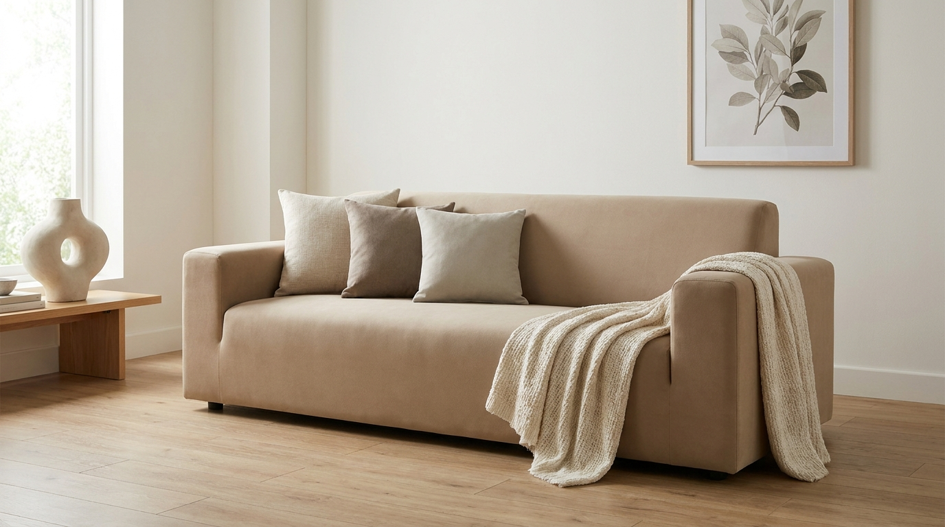
Lay a single throw along the back of the sofa or over one arm, with a soft, deliberate fold rather than a careless heap. One throw, placed well, reads as intentional. Two or three thrown together read as clutter. A soft knit boucle-style throw in a warm neutral does this beautifully — it adds a band of texture and a gentle weight to the sofa's line without competing with the cover underneath. The Boucle Sand soft knit throw is made for exactly this kind of quiet drape.
The throw should relate to the cover, not match it. Aim for a shade or a texture apart — a slightly warmer tone, a more textured weave — so the layer reads as a chosen pairing rather than an accident of having two of the same thing. Our throws and sofa protectors are designed to layer this way over a covered sofa.
4. Cushions: the smallest considered layer
Cushions are the finishing layer, and the one where small decisions show the most. Two principles carry almost every modern living room.
Use an odd number. Three or five cushions arrange more naturally than two or four — an odd group reads as relaxed and composed, an even one as rigid and showroom-styled. For most sofas, three is the calm choice; a larger or corner sofa can carry five.
Stay in a tonal family. Pick two or three shades that sit close to each other and close to the cover — a slightly deeper neutral, a soft accent, the cover's own tone repeated. A tight tonal range makes a small group of cushions feel deliberate. A scatter of unrelated colors makes the same cushions feel like leftovers.
A fresh set of cushion covers in a tonal family is one of the smallest changes you can make and one of the most visible — they pull the cover's color out into the rest of the room and tie the whole arrangement together.
5. Match the cover to the room's light
The same cover looks like two different colors in two different rooms, because light changes everything. It is worth a moment's thought before you commit.
A room that faces north receives a cooler, more even light. Warm-toned covers — sand, oat, a warm ivory — counter that coolness and keep the room from reading gray. A cool-toned cover in a north-facing room can look flat and a little chilly.
A room that faces south receives a warmer, stronger light that shifts through the day. Here a cover holds its color well, and cooler or more neutral tones — a pearl grey, a soft mist — stay calm rather than turning brassy in the afternoon sun.
The practical move: think about which way your main window faces, and lean your cover's undertone the opposite way — warm cover for cool light, cooler cover for warm light. It keeps the room balanced across the whole day.
6. Restyle the cover by season
A covered sofa does not need a different cover for each season — it needs a small seasonal adjustment in the layers around it. The cover stays; the styling shifts.
In the warmer months, lighten everything that sits on the cover. A finer, looser-knit throw, cushions in paler tones, less weight on the sofa overall — the room reads open and cool. In the cooler months, do the reverse: a heavier, more textured throw, a deeper accent or two in the cushions, layers that add warmth to the line of the sofa. The cover holds its color steady through both; the seasonal change is in the texture and the depth of what you place on top. It is the quickest way to keep a modern room feeling current without redecorating — and the throw is the piece that does most of the work.
7. Scale the styling to the size of the room
The same set of moves needs to be pitched to the room it sits in, because a small room and a large one carry styling differently.
In a small or compact room, keep the palette tight and the layers few — a neutral cover, one throw, three cushions in close tones. Restraint makes a small room feel calm and considered rather than crowded; too many competing pieces close the space down.
In a larger, more open room, the sofa can take more. A depth-tone cover holds its own across a bigger space, a larger sofa carries five cushions comfortably, and a second texture or a slightly bolder accent stops a big room from reading flat. The principle does not change — color first, restrained texture, tonal cushions — you simply scale the quantity to the room.
Styling mistakes to avoid
A few habits undo otherwise good styling. Worth knowing what they are.
- Too many patterns. Five competing prints make a room feel busy. Vary texture instead, and keep pattern to one quiet note at most.
- An even number of cushions. Two or four cushions read rigid and showroom-styled. Use an odd group — three, or five on a larger sofa.
- A piled, not draped, throw. A throw heaped on the seat reads as clutter. One throw, folded soft along the back or an arm, reads as intentional.
- A throw that matches the cover exactly. Two of the same tone looks like an accident. Relate the throw to the cover — a shade or a texture apart — so the pairing reads as chosen.
- Ignoring the room's light. A cool cover in a cool north-facing room reads flat and chilly. Lean the cover's undertone against the light, not with it.
None of these is hard to avoid. Each one is just a small check before you call the styling finished.
Three modern living-room looks
To make all of this concrete, here are three ways the same approach plays out — three covered-sofa looks, each calm, each modern.
Warm minimal. A warm-neutral cover — ivory or sand — a single boucle-style throw a shade warmer, and three cushions in two close neutral tones. Nothing competes; the room feels light, open and unforced. This is the look for a space you want to feel calm and uncluttered.
Soft contrast. A neutral cover with a throw and cushions pitched a clear step deeper — a soft clay, a muted olive — so there is gentle contrast without drama. The sofa stays calm but the layers give the room definition. This is the look for a space that wants quiet interest.
Tonal depth. A depth-tone cover — a grounded grey or a deep neutral — with throw and cushions kept within the same darker family. The sofa anchors the room and the layers reinforce it. This is the look for a space that wants a confident, modern center.
All three follow the same logic — cover color first, restrained texture, one throw, an odd group of tonal cushions. The only variable is how warm or how deep you pitch it.
A styled cover, a considered room
Styling a sofa cover is not a redecoration. It is a small set of deliberate choices — the cover's color set against the room's light, two or three textures instead of five patterns, one throw draped with intention, an odd group of tonal cushions. Together they turn a covered sofa into the calm center of a modern room.
That is the same instinct behind everything Covaba makes — that you can refresh a tired sofa and the whole room around it without replacing a thing. It is the heart of Covaba's "refresh, don't replace" philosophy: keep what you love, and style it well.
Frequently asked questions
What color sofa cover suits a modern living room?
A warm neutral — ivory, cream, sand, oat or soft grey — is the most versatile base, because it sits calmly in the room and layers easily. Choose a depth tone instead when the room is otherwise quiet and you want the sofa to be a confident focal point.
How many cushions should I use?
An odd number arranges more naturally than an even one — three for most sofas, five for a larger or corner sofa. Keep them within a tonal family of two or three shades close to the cover, so the group reads as deliberate rather than scattered.
Should the throw match the cover?
Relate, don't match. Aim for a shade or a texture apart — a slightly warmer tone, a more textured weave — so the throw reads as a chosen pairing rather than two of the same thing. One throw, draped with a soft fold, is all the room needs.
Can a sofa cover look high-end?
Yes. A high-end look comes from fit and restraint, not price. A cover sized correctly and tucked in cleanly, paired with one throw and a tight group of tonal cushions, reads as a considered design choice — far more than a room layered with too many competing pieces.
Closing
Style the cover, and the room follows. Color first, texture with restraint, one throw, an odd group of cushions — and a sofa cover stops being protection and becomes the calm center of a modern living room.